Chrome may be the default browser on Android, but more people are trying this instead
Technology · July 15, 2026

When macOS Tahoe was released last year, it featured a major graphical makeover of the UI. With the just-announced successor to Tahoe, macOS Golden Gate, Apple is making adjustments to those changes. Why? A lot of it is because of user and developer feedback, while another reason is that Apple may have realized that some of the visual elements needed some fine-tuning.
Here are five examples of how Apple changed the way macOS looks in the Golden Gate developer beta. Since this is the very first beta, the company could make further tweaks before the official release this fall.
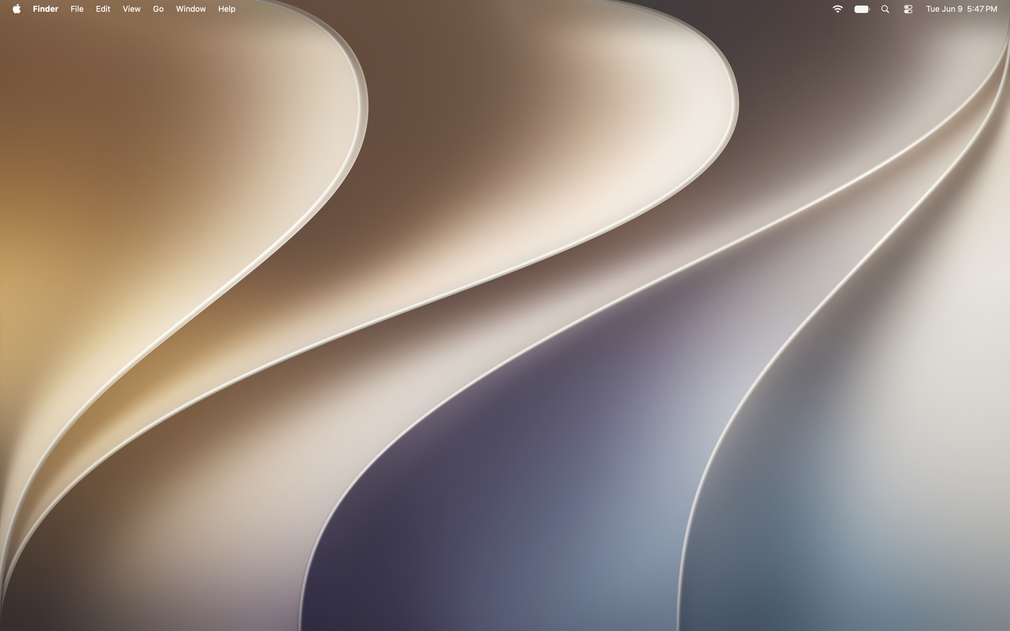
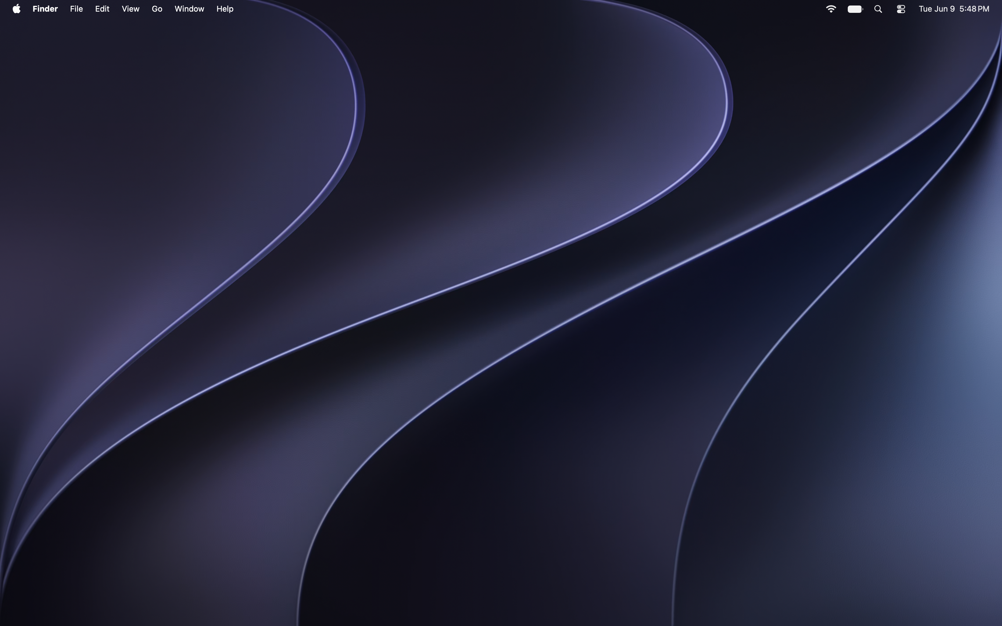
With every major update of macOS, Apple includes a new wallpaper. You can pick from the light (left) or dark (right) versions, or you can have them switch automatically between the two based on the time of day.
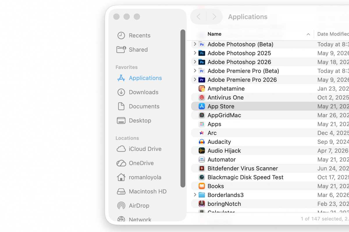
macOS Tahoe sidebar.
Foundry
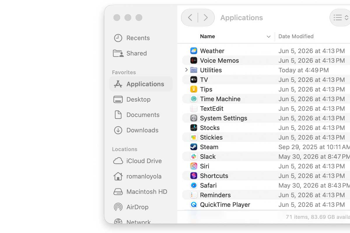
macOS Golden Gate sidebar.
Foundry
In macOS Tahoe, Apple introduced the “floating” sidebar (top), but Apple is now shading the whole column in macOS Golden Gate (bottom). Apple has also updated the corners of windows so that they’re consistent look throughout the OS.
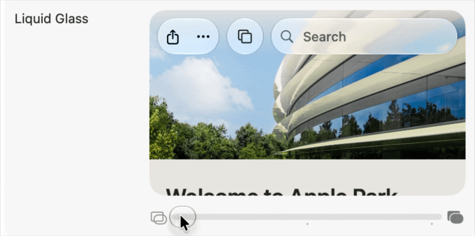
A new Liquid Glass setting can be found in System Settings.
Foundry
In macOS Golden Gate, you can now make the Liquid Glass effect more or less transparent in System Settings > Appearance > Liquid Glass. With the developer beta, you are asked to adjust this setting after the OS installs.
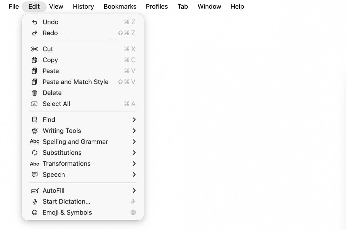
In macOS Tahoe, Apple decided the more icons in menus, the better.
Foundry
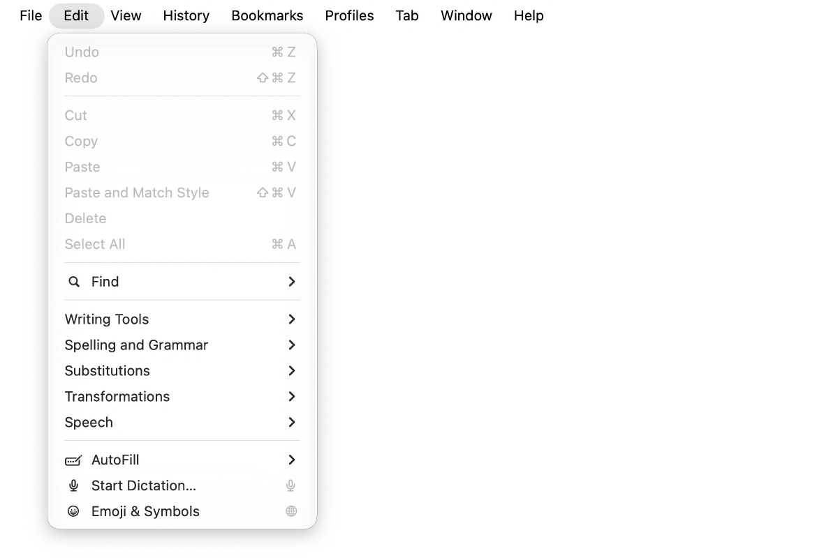
Not every menu item has an icon in macOS Golden Gate.
Foundry
Apple has decided that not every item needs an icon in its menus, which makes for a cleaner look.
Apple is introducing the ability to add Liquid Glass effects to app icons, so you’ll probably see this effect in upcoming third-party app updates. This is evident in the Maps app icon. But Apple also tweaked the overall look so it’s not as soft and has more contrast. Some Apple app icons have added more outlines and borders. Here are a few examples.
Maps: macOS Tahoe (left) and macOS Golden Gate.
Apple
App Store: macOS Tahoe (left) and macOS Golden Gate.
Apple
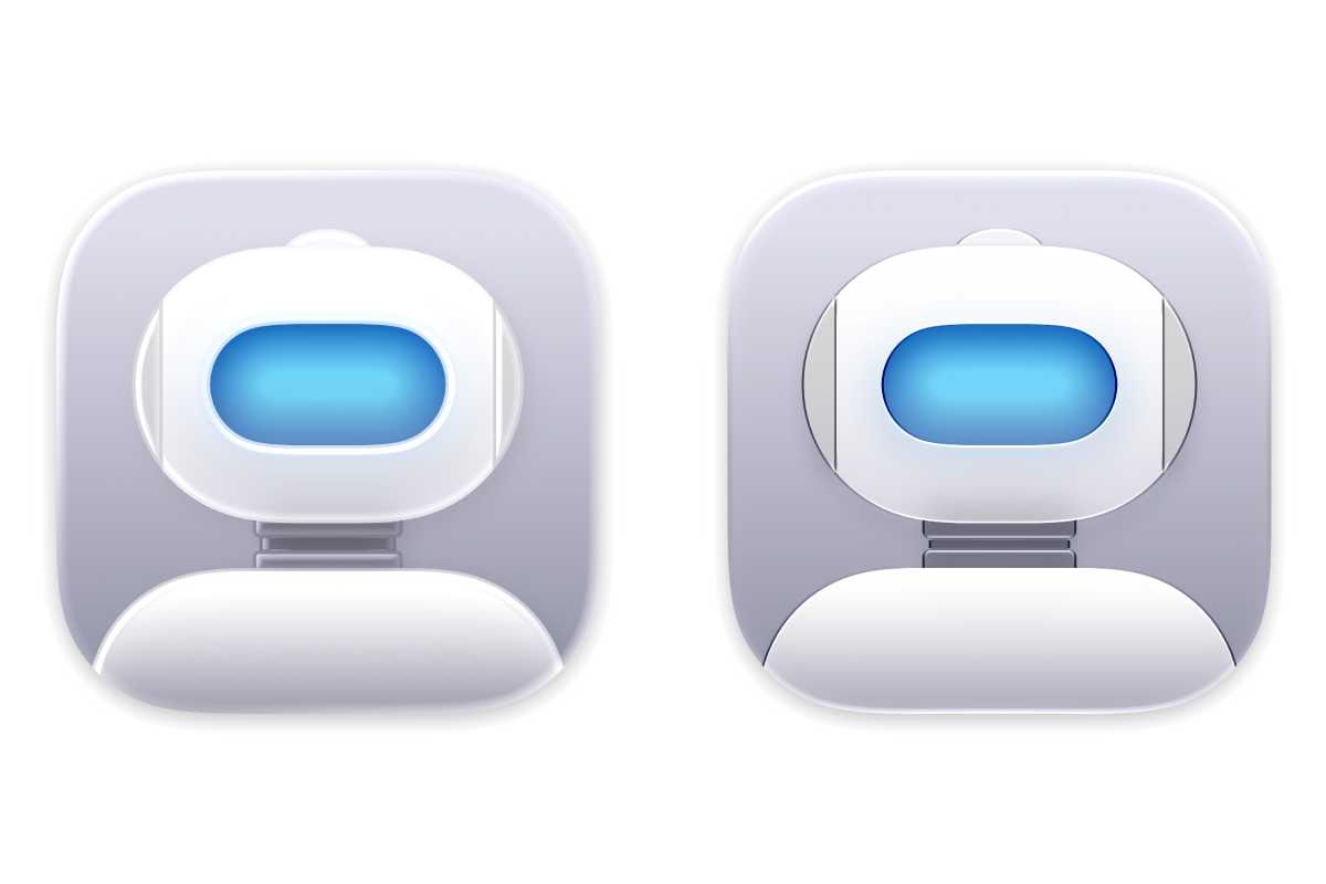
Automator: macOS Tahoe (left) and macOS Golden Gate.
Apple
FaceTime: macOS Tahoe (left) and macOS Golden Gate.
Apple
Siri: macOS Tahoe (left) and macOS Golden Gate.
Apple